For this project in photography, I studied photos made by Eileen Quinlan. Though she takes a wide variety of photos, I chose to imitate the concept of spatial fracturing in Quinlan's use of mirrors in some of her photos, specifically #200 and #202 in her Smoke and Mirrors album. Unfortunately, it was difficult to take photos the way Quinlan did with her mirrors, so I improvised by cutting up my photos and putting them back together differently than they had been before, effectively creating the sense of spacial uncertainty in her Smoke and Mirrors photos. By using multiple photos or utilizing different aspects of the same photo, I also attempted to imitate her dynamic color scheme. Sometimes I also used editing to provide the extra flare and vibrancy that her mirrors provided some of her colors with. For the next draft, I'd like to increase the amount of photos and resources I have when building my photos, and also get cleaner images without glare.
Thursday, October 25, 2018
Artist Draft 1
For this project in photography, I studied photos made by Eileen Quinlan. Though she takes a wide variety of photos, I chose to imitate the concept of spatial fracturing in Quinlan's use of mirrors in some of her photos, specifically #200 and #202 in her Smoke and Mirrors album. Unfortunately, it was difficult to take photos the way Quinlan did with her mirrors, so I improvised by cutting up my photos and putting them back together differently than they had been before, effectively creating the sense of spacial uncertainty in her Smoke and Mirrors photos. By using multiple photos or utilizing different aspects of the same photo, I also attempted to imitate her dynamic color scheme. Sometimes I also used editing to provide the extra flare and vibrancy that her mirrors provided some of her colors with. For the next draft, I'd like to increase the amount of photos and resources I have when building my photos, and also get cleaner images without glare.
Saturday, October 6, 2018
Portraits
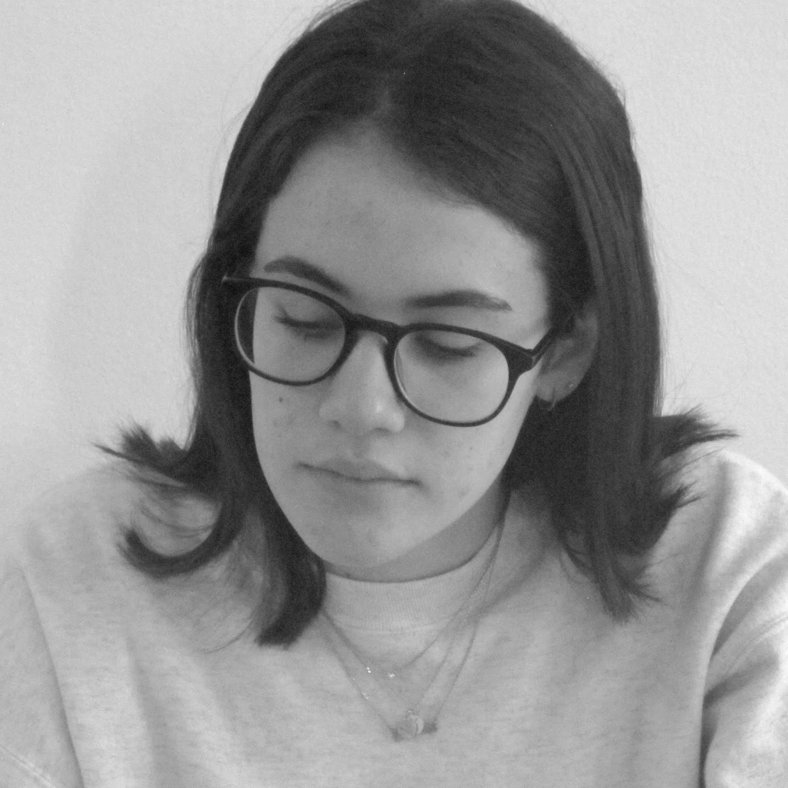
For this project on portraits, my photos were based on the style and technique of Richard Avedon, who was renowned for his fashion and portrait photography. Thus, in my photos, I utilized his setup of a black and white square frame with a white backdrop. This in addition to his concept of keeping more moderate lighting allows for greater focus on the person themselves by getting rid of the colors and details that would be present in the background of a regular photo. Bringing out these expressions in the person is the core of Alvedon’s work: to bring the authentic and hidden emotions into the spotlight. This is what I attempted to do in my own photos with the person I was photographing.
Portraits
Friday, September 28, 2018
Composition
For my project on Composition in photography, I illustrated the concepts of symmetry, asymmetry and balance in my photos. For symmetry, where exactly similar parts mirror each other across an axis, I set up all my photos to have a reflection of the same image on either side of the picture (left and right), such that both colors and shapes are an exact match to eachother. For asymmetry, the opposite of symmetry, where the parts of the image don't match across a center, I made the two halves of the photos on the left and right side unequal, sometimes by way of color, shapes or both. For balance, where two halves of the image have an equal amount of "weight" and draw the attention of the viewer relatively equally, I took photos with halves containing similar amounts of elements to eachother, whether related to colors, objects or both.
Symmetry
Asymmetry
Balance
Friday, September 21, 2018
Pictorial Lines
For this project on showing "pictorial lines" in photography, I used the concepts of "arrangement of lines", "decoration of lines" and "lines leading to a subject" in my photos. For arrangement of lines, I set up my photos so that they have a singular element in the form of lines, in that if the lines are taken away, there will be nothing left in the photo to observe besides a solid color. For the decoration of lines concept, I center the focus of the image on a particular object or element, also including other elements or "decorations" in the form of lines that maybe improve the image but don't represent or interfere with the topic or subject of the photo. Lastly, for the concept of lines leading to a subject, which is pretty self explanatory, I use lines to draw the focus of the viewer to the subject of the image: the particular object or element in question.
Lines Leading to a Subject
Arrangement of Lines
Decoration of Lines
Subscribe to:
Posts (Atom)